
I’ve mentioned it a few times before: I prefer Rdio to Spotify (what’s a Rhapsody?). I’ve expounded upon this in the past, and now, even a few years on, Spotify has done little to win me over (more in another post). But as I began testing the two at some length over the past couple days, head-to-head usage left me with one very important thought: Rdio wins at design, and that matters.
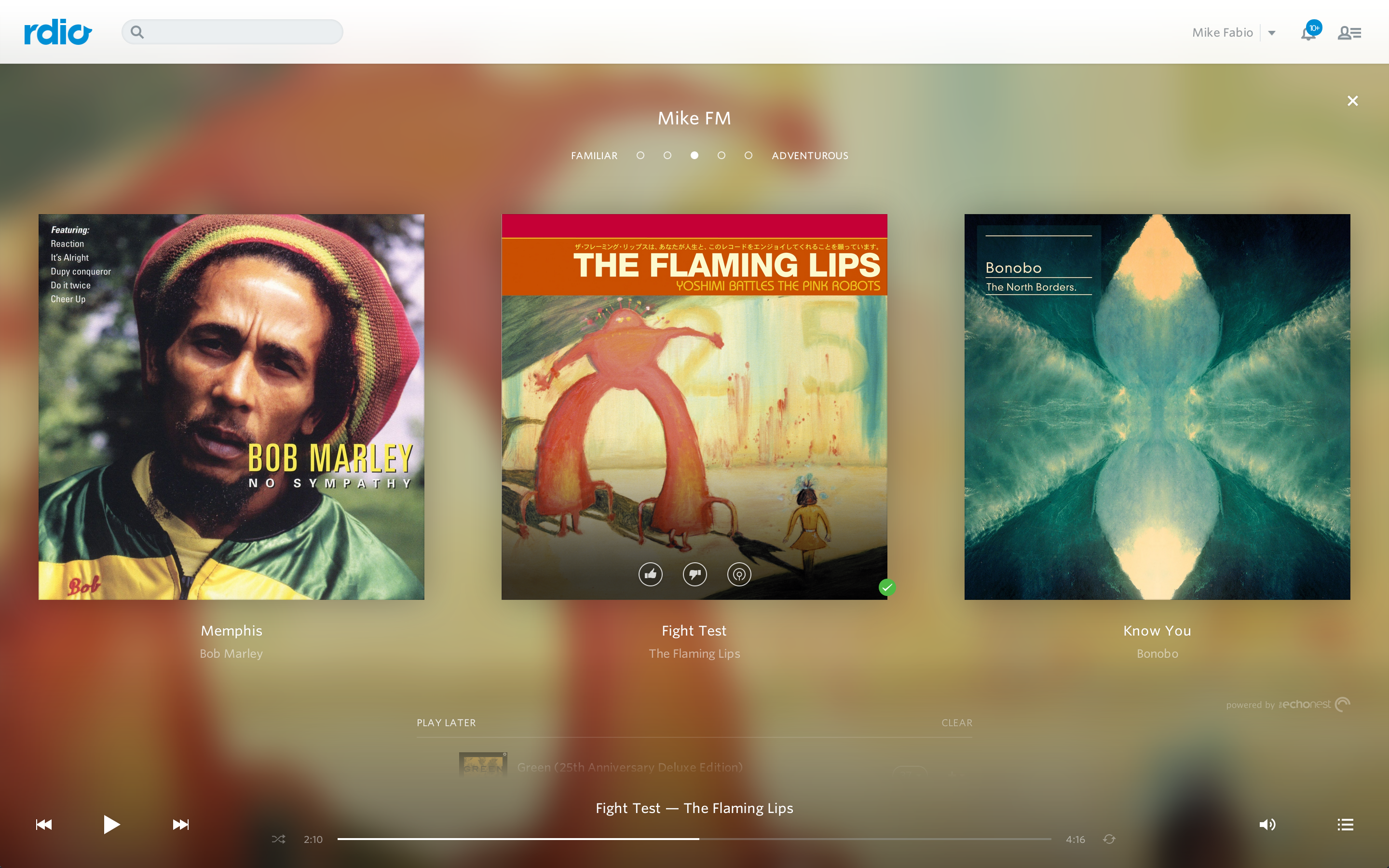
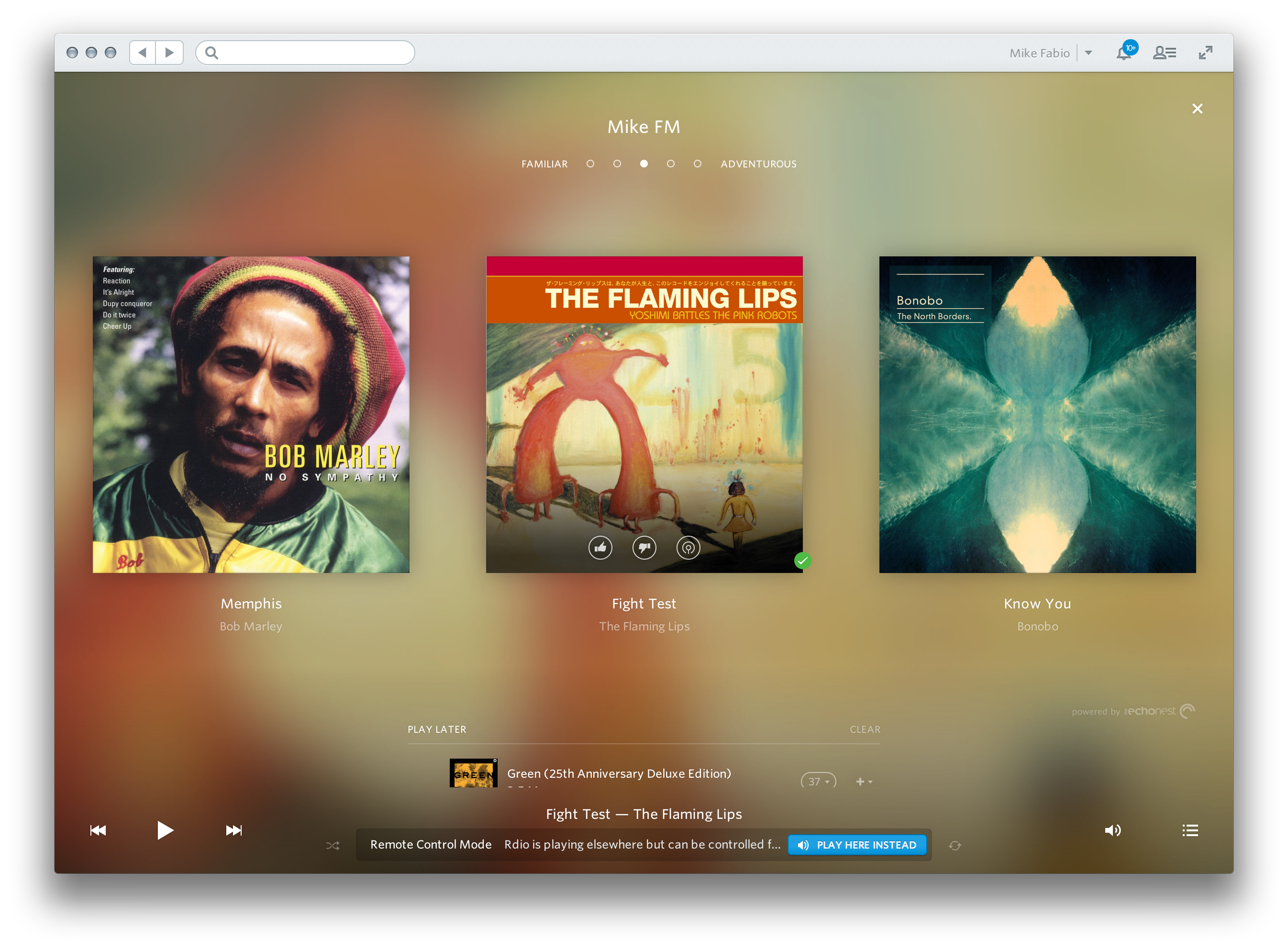
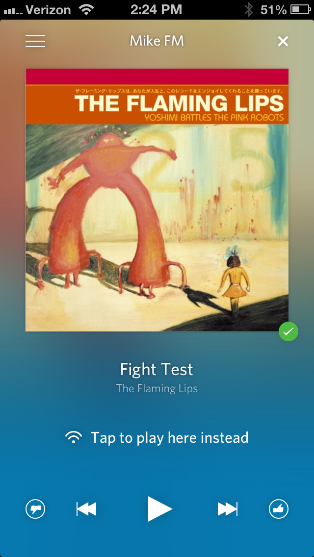
Today Rdio launched a pretty cool feature that lets me queue up a radio station based on my listening habits They’ve had similar features before, but the new “Me FM” feature is not just functional, but beautiful. Moreover, it highlights something that I find very important, and that is unified interfaces among platforms.
Both Rdio and Spotify have interfaces built for iPhone, iOS, web, and desktop, but Rdio’s apps look and feel the same on every platform (I don’t have an Android device to test with). Spotify takes odd design queues from each platform independently, and ultimately lose a lot of the coherence that makes the Rdio experience so pretty. (And don’t even get me started on how annoying it is that my Spotify queue isn’t synced across devices, or that I can’t pick up immediately where another device is already playing.)
Here are Spotify’s interfaces:
-
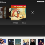
- Spotify Web
-
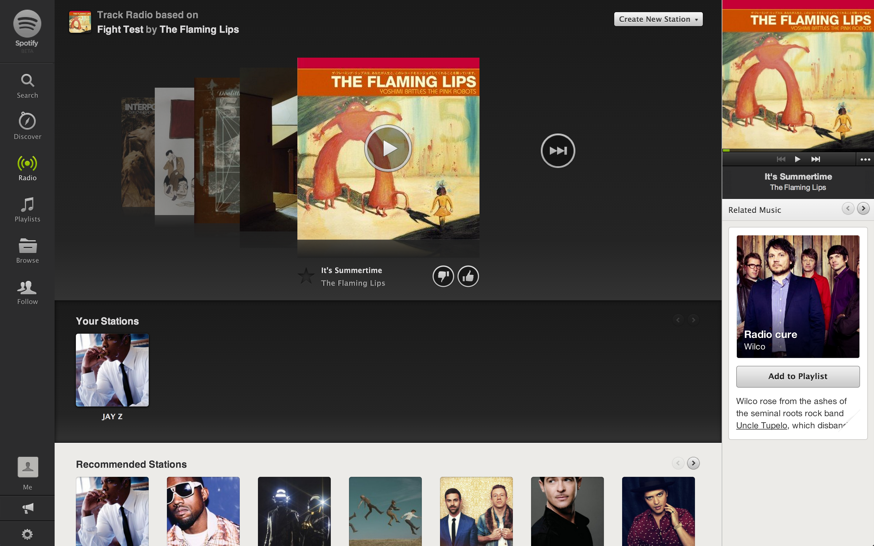
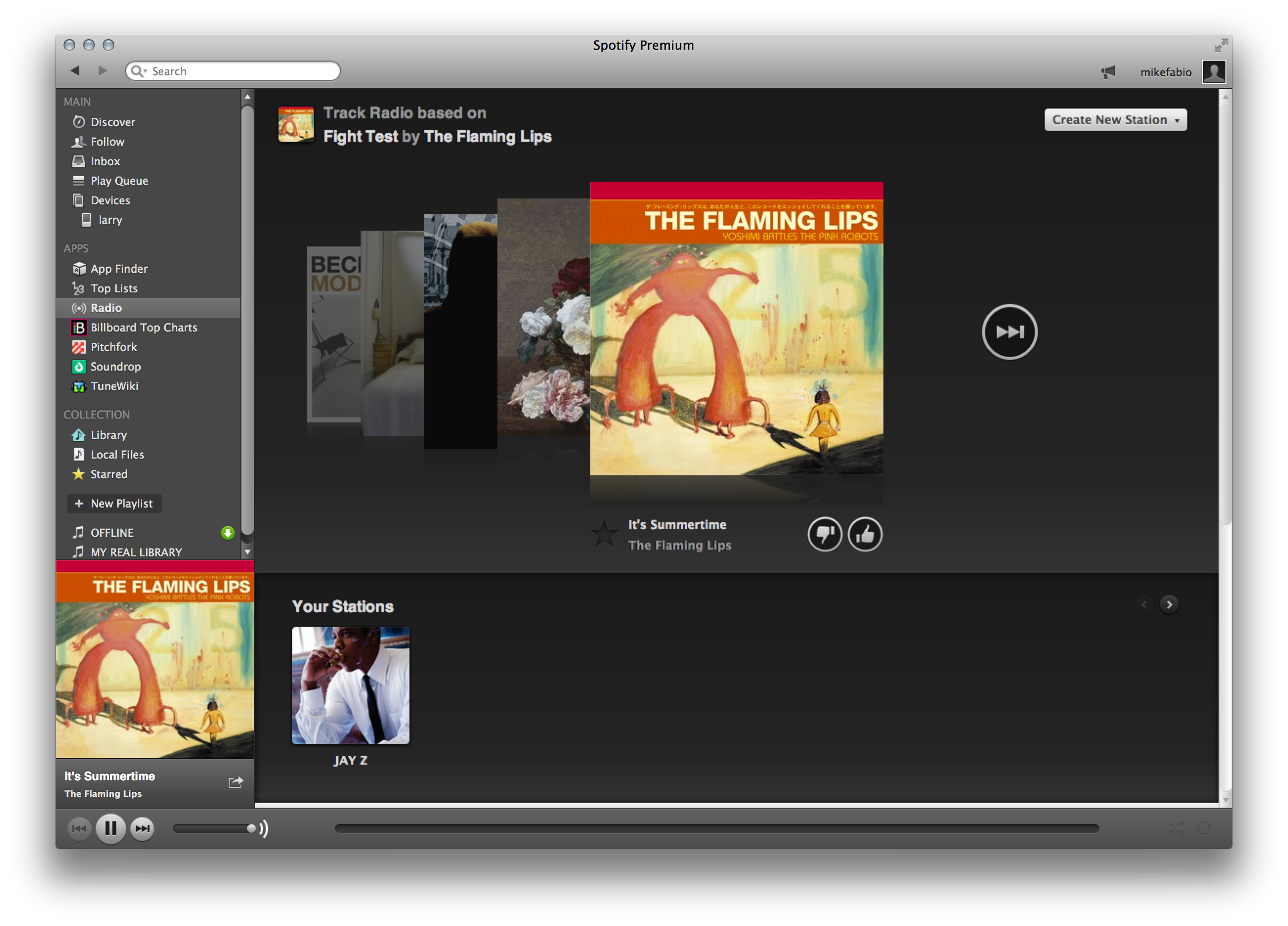
- Spotify Desktop
-

- Spotify iPhone
-
- Spotify iPad

And here are the Rdio interfaces:
-
- Rdio Web
-
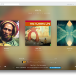
- Rdio Desktop
-
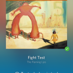
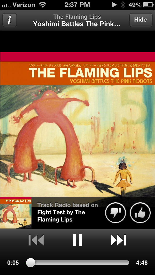
- Rdio iPhone
-
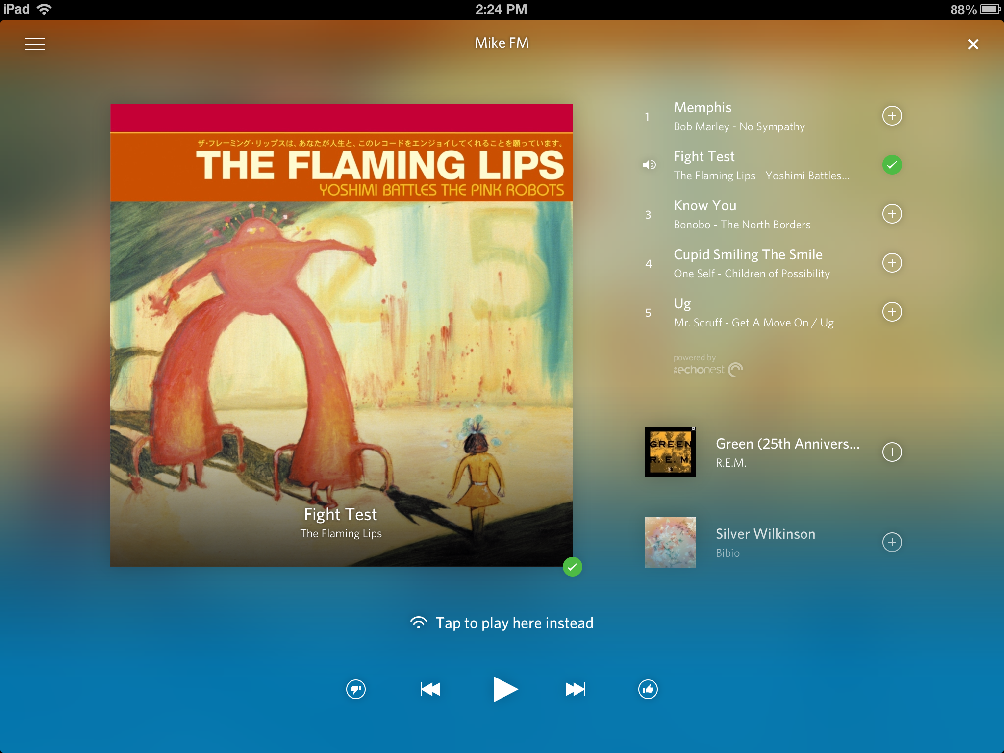
- Rdio iPad
Now I’m not a designer, nor do I have the expertise to critique these designs based on their aesthetics, usability features, accessibility, or whatnot.
What I can do is tell you that, for whatever reason, the Rdio design makes me feel better listening to music.
Experience, design, these things matter, and in my opinion they make or break the success of software, at least when comparing two similarly featured products. The devil is most certainly in the details.